Before someone reads your Bio or opens a post, they already perceive something: clarity, confusion, order or improvisation.
An Instagram layout isn’t just a visual choice. It’s the first layer of communication within a profile.
Treating it as a simple graphic exercise limits its potential. Seeing it as a language, instead, allows you to become coherent and recognizable or, if it lacks intention, generic.
Why an Instagram layout is more than aesthetics
A feed can look harmonious and still say nothing.
It can be minimal and feel powerful.
It can be imperfect and convey authenticity.
The difference doesn’t lie in graphic perfection, but in the alignment between what is seen and what the brand intends to communicate.
An Instagram layout becomes strategic when it reflects:
-
positioning
-
tone of voice
-
target audience
-
profile objectives
When these elements aren’t clear, even the most curated feed remains superficial. Aesthetics alone do not build identity.
The layout as the first layer of communication
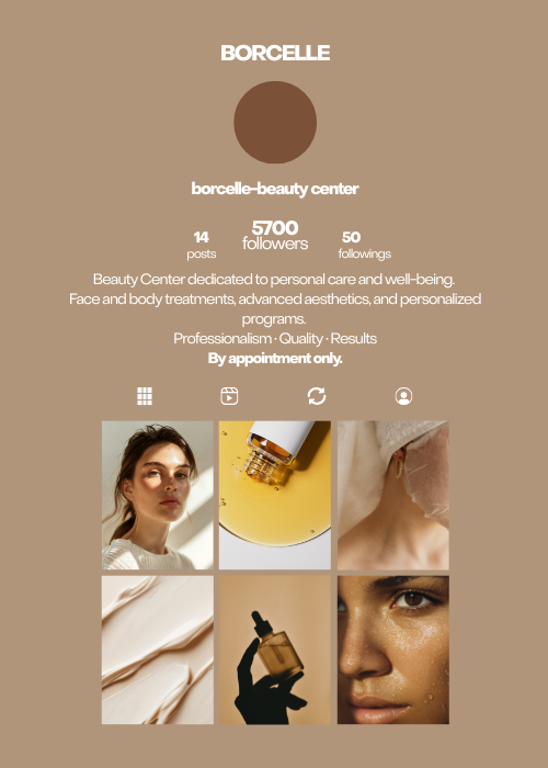
You can think of an Instagram layout as the homepage of a website: within seconds, it should help visitors understand where they are and whether it’s worth staying.
The layout acts as a filter. It communicates professionalism, intention, and clarity.
A coherent profile communicates purpose.
A disorganized one communicates improvisation.
An overly rigid one communicates fear of stepping outside the pattern.
It’s not about having a perfect grid, but about building a recognizable visual structure through color choices, format alternation, text presence, and intentional use of imagery.
There are different ways to create harmony within a feed while staying aligned with your industry and audience – we explore this more in detail in a dedicated article.
The visitor’s journey
When an Instagram layout is designed with intention, it does more than look organized – it guides the eye and shapes understanding.
If the structure is clear, visitors don’t struggle to understand who you are and what you offer. They don’t need to interpret or search for clues.
This is what happens when a layout communicates before it explains.
A profile built this way naturally leads visitors through essential stages that support the return you expect from your efforts:
-
initial feed exploration
-
discovery of value
-
understanding of your offer
-
decision to contact you or make a purchase
A layout doesn’t force the journey, it simply makes it possible.
Visual consistency, recognition, and identity
A brand, just like a creator, can define:
-
a consistent color palette
-
a specific visual or photographic style
-
a balance between educational, visual, and interactive content
These choices must serve the message, not the other way around.
When the layout becomes a creative constraint, something has shifted. What holds everything together is not the grid, but the vision behind it.
The goal is not to replicate the same pattern repeatedly. The layout should maintain a recognizable identity, even as content varies.
When the layout becomes a limitation
An overly structured feed can slow down content production.
It can create the fear of “breaking the harmony” and turn every post into a design puzzle.
In those cases, the layout stops being a tool.
Often, the issue isn’t the layout itself, but the absence of a clear strategic vision behind it. This is where an external perspective can make a difference. A focused consultation helps realign objectives, priorities, and the real role of the feed within your broader strategy.
Instagram evolves quickly: new formats, shifting behaviors, changing ways of consuming content. A brand must be able to evolve alongside its layout, transforming it into a dynamic space without losing identity.
Conclusion
Don’t think of your layout as a visual structure designed to please everyone. It’s not decoration – it’s recognition.
It’s not only about what people see, but about the decisions you make before publishing.
A layout is a positioning tool. It defines your visual identity and forms part of your strategy. It should be considered within a broader system made of content, tone, objectives, and audience.
At OniGrow, our approach is built on this integration between form and strategy. We work on the overall identity of your profile so that every element contributes coherently to organic growth.
If you’d like to explore how our method could support your project, feel free to reach out to us on WhatsApp.